You can create a Bar graph in Google slides by following this method. You can also update the linked graph in your Google Sheets. You can use this method on Windows PC/Laptop, Online or even your Android or iPhone.
Using charts in your presentation can allow you to simplify complex numerical or statistical data. It will also help your audience understand what you are presenting.
How to Create a Bar Graph in Google Slides
In order to get started on the process of setting up your slideshow, you may either create a completely new file or access an already existing project. When a chart is made in Google Slides, a link to a document in Google Sheets is automatically created.
This happens whenever a chart is created. In addition, if you have already made a graph other than Google Slides, you may quickly import it into the presentation software.
- To insert a chart, select the slide.
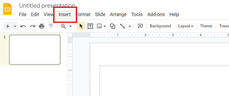
- To create a chart, select Insert > Chart.
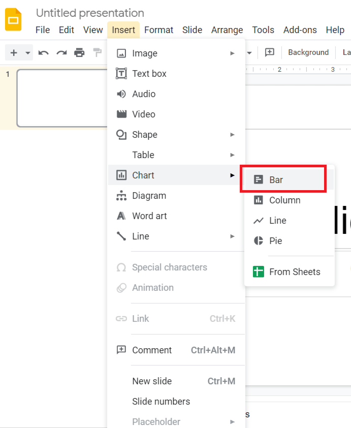
- To create a bar graph in Google Slides, click on the bar graph icon.
- After choosing the chart type, it wiGoogle Slides will insert an existing chart into your presentation.
Read more: How to Create a Graph in Google Sheets
How to Update Linked Bar Graph in Google Slides
After you’ve added the bar graph to your slide, you’ll need to update the bars as needed. Now, here you need to keep in mind that the moment you insert your bar graph or any other graph into your Google slides, it will immediately become linked with Google sheets. Moreover, there are two effective methods to update your bar graph in Google slides are:
- Using Open source
- By copy & Paste
Read more: How to Use SUMIF Function in Google Sheets
Method 1. Using Open source
In order to utilize this chart, you will need to create your own. Linked Chart choices can be found by clicking on them in the ‘Edit Linked Chart’ menu. By clicking here, you open the linked document, which is a “Google Sheet,” and you can change it to get what you want. Furthermore, to bring your chart up to date, perform the procedures specified in this manner as well as the steps outlined above.
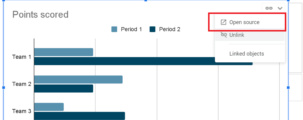
- You can select Open source from the Link choices available in your bar graph. It will now open in a new tab in Google Sheets.
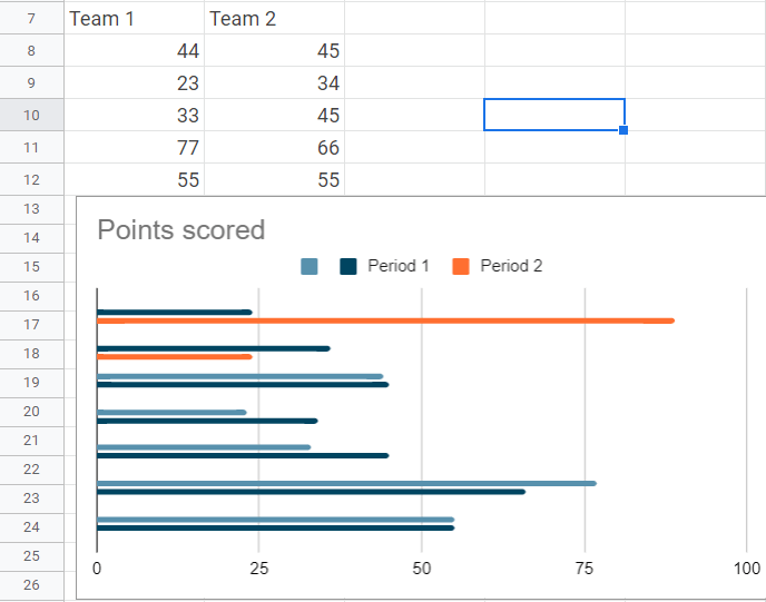
- As soon as you finish editing the data or design in Google Sheets, go back to Google Slides.
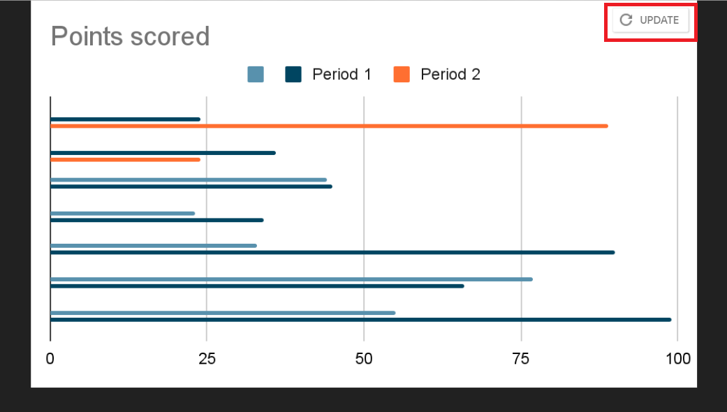
- Select the Update icon, To apply the modifications.
Read more: How to Make Negative Numbers Red in Google Sheets
Method 2. By copy & paste
If you are unable to access the update option on your Google slide, you can try the following actions as an alternative.
- By using the keyboard shortcut Ctrl/Cmd + C, you may copy the chart from Google Sheets into your Google Slides presentation instead.
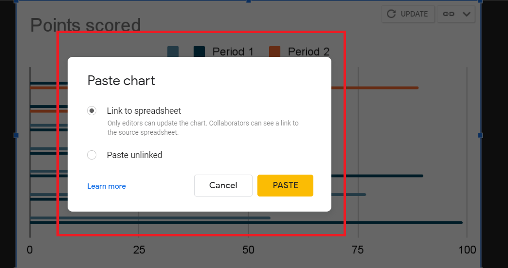
- Upon pasting the chart, you will have an option to link it to the original spreadsheet.Choose according to your preference.
Read more: How to Make a Gantt Chart in Google Sheets
Modify Your Data Points Color
Although this simple bar graph has evolved considerably, it remains tedious to use. The easiest way to make a room look bright and inviting is to use colour. If you would like to change this, select Chart editor > Customize > Series and then click Add next to Format data point.
As soon as you press the Add button, a dialogue box will pop up and ask you to select a data point. Once the data point has been selected, press the OK button. You can also remove individual colours from your data points by simply deleting the data points in your Series section.
Read more: How to Group Worksheets in Excel
Conclusion
If you like, you can also change the size and orientation of the graphs and charts. Drag a corner box inwards or outwards to resize the chart by selecting the item once. Blue boundaries are displayed after selecting the item. Also, Avoid using 3D graphs or other flashy features since they can distort the data you’re trying to convey.
Leave a Reply